Member-only story
Living in Bomb Time — 20
Climate Report Part Three continued:
Heat doesn’t “just happen”
Where it’s coming from and why that matters

Take a moment to look carefully at the chart above. It’s from the last IPCC report and it’s shocking in what it tells us is happening with the world’s climate system.
Remember, the IPCC reports use numbers that are the result of compromise and negotiation. Historically, they have underestimated the speed and scope of the effects increasing levels of CO2 would have on the climate system. You should probably view these numbers as “optimistic”. Realistically the actual numbers are probably worse.
Which is why you should be scared that they are saying global warming is now between 1.5℃ and 2.0℃.
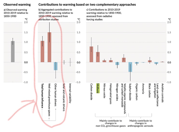
See the grey bar on the far left. The one that says, “Observed Warming”. That’s the 1.1℃ that the GISS, NOAA, and the IPCC are saying is the total amount of global warming since “the late 19th century”. When the mainstream press says there has been 1.1℃ of warming from increasing levels of CO2 in the atmosphere. That’s the number they are using.